


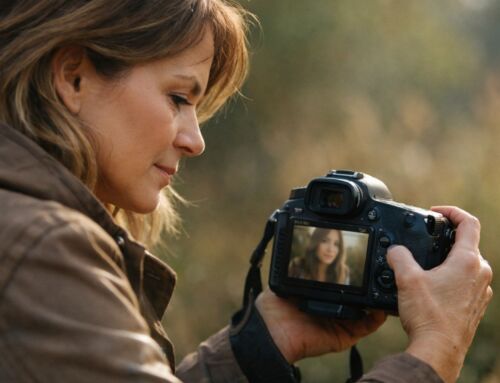
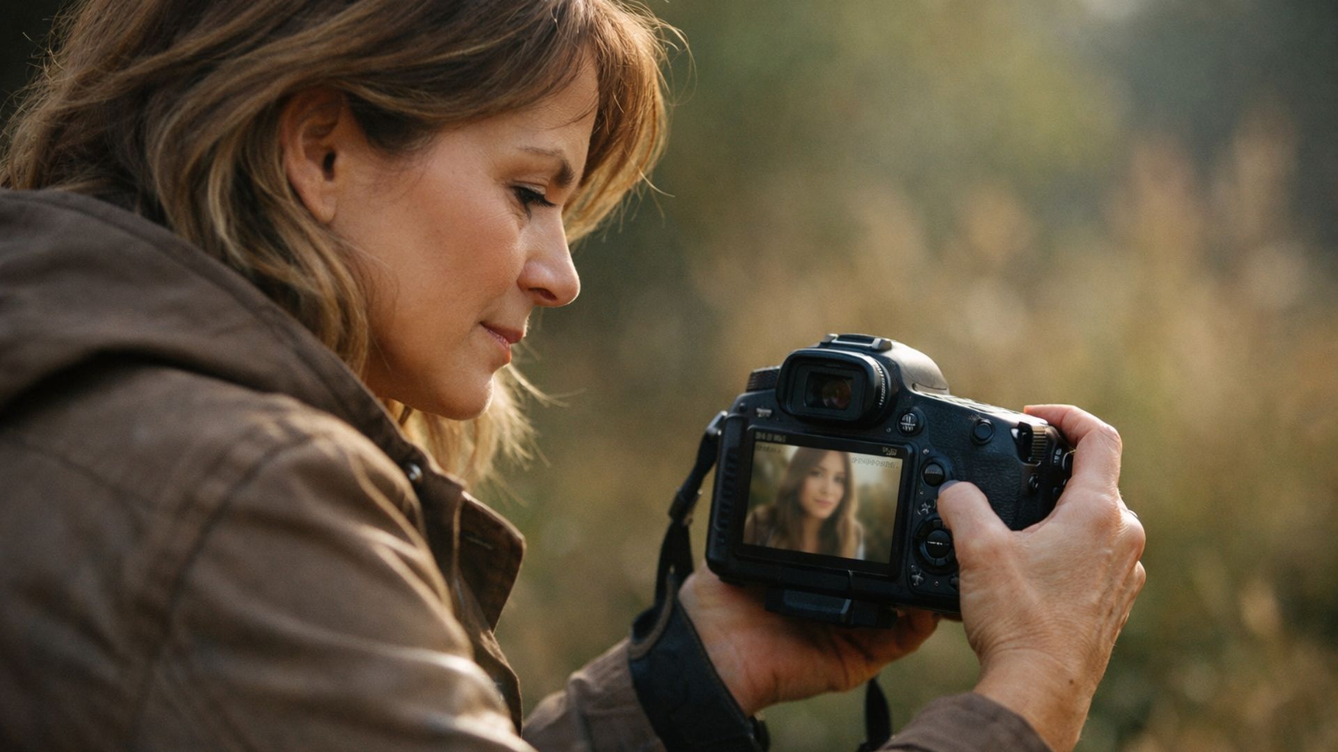
Y ou finish editing a photo in Lightroom and something feels off. The exposure is fine, the colours look decent, but the image just doesn’t have the crispness or presence you expected.
It looks soft, slightly hazy, or oddly dull, even though nothing seems obviously wrong.
This is a common Lightroom frustration, and it often gets misdiagnosed as a focus issue, a camera problem, or a lack of sharpness. In reality, there is one Lightroom setting that quietly strips energy from photos when it’s misunderstood or overused.
Once you know where to look, this issue becomes easy to fix.
Why Photos Can Look Soft Even When They’re Sharp
Soft looking photos aren’t always out of focus. In many cases, the detail is there, but contrast and micro contrast are missing.
Lightroom gives you several tools that affect perceived sharpness, not actual sharpness. When these are pushed too far, images lose texture, depth, and clarity. The result is a photo that feels flat and lifeless, even though the technical sharpness hasn’t changed.
This is especially confusing for beginners because the image doesn’t look “wrong,” it just doesn’t look finished.
The Setting That Causes the Most Damage
The setting responsible in most cases is Clarity.
Clarity increases midtone contrast. Used carefully, it adds punch and definition. Used too heavily, it does the opposite. It compresses tonal transitions, exaggerates edges, and creates a muddy, crunchy look that drains natural depth from the image.
This is why photos can look harsh in some areas and strangely flat in others at the same time.
Why Clarity Feels Helpful at First
Clarity is tempting because it produces instant results. You move the slider and the image changes dramatically. Texture pops, contrast increases, and details appear stronger.
But clarity doesn’t discriminate. It affects skin, skies, foliage, shadows, and highlights all at once. When pushed globally, it removes subtle tonal transitions that make photos feel natural.
This is one of the reasons images can end up looking over processed even when exposure and colour seem controlled.
How Clarity Interacts With Your Workflow
Clarity should never be the first thing you touch. It reacts strongly to exposure, contrast, and tone.
If your editing order isn’t solid, clarity amplifies existing problems. This ties directly into A Simple Lightroom Editing Order That Instantly Improves Your Results, where structure and sequence prevent small issues from becoming big ones.
Clarity works best when the foundation is already correct.
Clarity vs Texture vs Sharpening
Many photographers confuse clarity with sharpening.
Sharpening enhances edges and detail. Texture affects fine detail. Clarity affects midtone contrast. They serve different purposes.
Using clarity to “fix” softness often makes images worse. If your photos lack pop, the issue is usually contrast or tone, not clarity.
If your images feel flat, this is often better addressed through contrast, something explored in Fix Flat Photos in Lightroom: 5 Easy Tips for Vibrant, Professional Images.
Why Overusing Clarity Kills Colour
Clarity doesn’t just affect contrast, it affects colour perception. Heavy clarity dulls colour transitions and can make colours feel dirty or muted.
This often leads photographers to increase saturation to compensate, which creates a second problem. This chain reaction is one of the most common causes of unnatural looking edits.
If your colours feel wrong even though exposure looks fine, this connects closely with Why Your Lightroom Colours Look Wrong Even When Exposure Is Fine.
How to Use Clarity Properly
Clarity works best in small amounts and in specific situations.
Use it subtly on landscapes, architecture, or textured surfaces where midtone contrast adds interest. Avoid heavy clarity on portraits, skies, or soft light scenes.
In many cases, negative clarity can be useful for skin or atmospheric images, adding softness without destroying detail.
Always apply clarity after exposure and contrast are set, and before final sharpening.
A Better Way to Add Depth
If your images feel lifeless, try this instead:
– Correct exposure first
– Add contrast gently
– Refine highlights and shadows
– Use texture sparingly
– Use clarity only if needed
This approach preserves natural depth without forcing detail.
Why Less Clarity Often Looks More Professional
Professional looking edits usually rely on restraint. Subtle contrast, controlled tone, and clean colour relationships do more for an image than aggressive sliders.
When clarity is overused, photos start to look heavy and processed. When it’s used lightly, it supports the image without drawing attention to itself.
If you want a simple reference you can come back to while editing, I’ve put together a short PDF called 5 Fast Fixes for Flat Photos. It walks through the most common issues beginners run into and shows how to fix them cleanly, without overcomplicating things.
If you’d rather not wrestle with an edit yourself, I also offer simple photo editing help through Buy Me a Coffee. You can upload a photo and I’ll edit it for you, or help you understand what’s going wrong so you can fix it next time.
If there’s something in Lightroom you’re struggling to fix or understand, feel free to leave a comment. I read them all and use real questions to shape future posts.


Leave A Comment